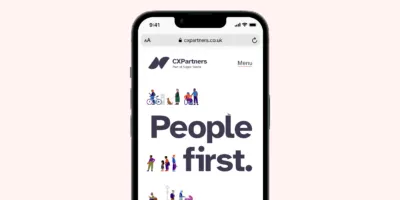
1) We have a new visual identity: a new logo, a new typeface specifically designed for readability, a new colour palette, illustration style (courtesy of the brilliant Ryan Todd), and photography style (courtesy of the equally brilliant Nick Hand). It’s more simple, and more usable.
Our new logo.
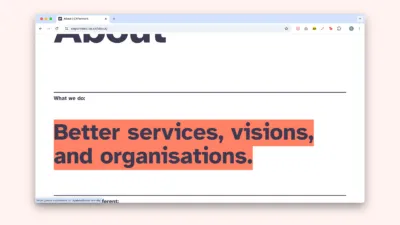
2) We’re clearer about what we do: Better service, visions and organisations.
Find more about what we do on our About page.
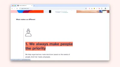
3) Clients wanted to know what makes us different. So we’re clearer about that too. Scroll down our home page to see.
Our home page tells you what makes us different.
4) We speak in plain English. We’ve tried hard to avoid jargon and weasel words. But if you spot any – let us know!
We’ve tried to be plain speaking throughout the site.
5) We’ve created a new format for our case studies. Go to our Work to see.
We wanted to give clients more “snack-able” content. So now include a short summary and we’ve imposed tough word limits!
We focus on what we did for clients and the outcomes, rather than getting bogged down in the process.
We use examples to make abstract concepts more concrete. For example, we show our conversation design in our NHS case study.
We share key insights from our work.
Our NHS case study. We show a conversation design to make the abstract design principles that we discuss, more concrete.
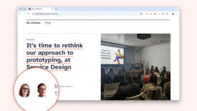
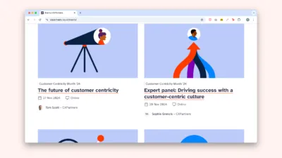
6) We show more of our team. Clients and staff wanted to know who they would be working with, and what it would be like. So we show people’s faces in lots of places, like our blog listings. And our people page shows the whole team.
Profile pictures of our team on our blog.
7) We show people where we’re heading with “our ambition for the future”. We tell you about our values, goals, what we’re doing to achieve them.
We now have a page about our ambition for the future.
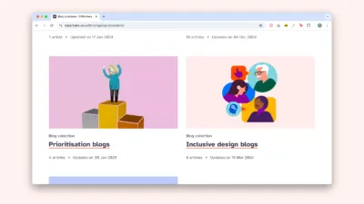
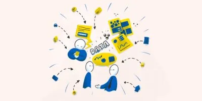
8) We have a new Thinking section, for our thought leadership. It includes blogs, white papers, and “Insights”. (Fun fact: each Insight has its own colour theme, based on the colour of the houses in Hotwells, Bristol).
Two of our “Insights” in our new Thinking section.
9) We have a new events section. We host a lot of events, including our annual Customer Centricity month. These didn’t have a home before, but now you can check out our upcoming and past events.
Finally, one smaller change is that our contact form is more inclusive. We don’t ask for separate first and last names, and we then use a bit of code to understand how people want to be addressed in emails.